Christmas in July

OVERVIEW

Christmas in July is a Zendesk holiday gifting campaign for which I developed the campaign's visual language – a Christmas-inspired system applied across an Advent Calendar chocolate box, a personalised A5 card, an at-home cocktail kit, and delivery packaging, all within Zendesk's brand guidelines.

YEAR

2021

ROLE

Art Director

SERVICES

Creative Direction

Concept Development

Campaign Visual Language

Packaging Design

Stakeholder Alignment

About the project

Brief

Develop a Christmas-inspired infographic system for Zendesk, adhering to brand guideline, that could apply consistently across four very different physical formats: an Advent Calendar chocolate box, a personalised A5 card, an at-home cocktail kit, and the delivery packaging itself. As Lead, the real challenge was translating the campaign's written copy into a visual language distinctive enough to work as a gift experience — not just another branded asset.

Concept

The first concept stayed fully within Zendesk's brand guideline (abstract shapes at the time) – and it was rejected. It was technically on-brand, but it didn't reflect the vision the client and marketing manager actually had for the campaign. Rather than iterate within the same visual territory, the project moved into a second concept stage, exploring ideas that were, quite literally, "out of the box" – pushing how far a seasonal campaign could stretch a brand's visual system before it stopped reading as Zendesk.

The second direction became a playful, illustrated advent-calendar system, built to balance three sets of needs at once: brand consistency for Zendesk, creative distinctiveness for the marketing team, and a tactile, giftable experience for the end customer.

Execution

As designer, I developed the visual language and carried it consistently across all four formats (the Advent Calendar box, the A5 card, the cocktail kit labelling, and the delivery packaging) ensuring each piece read as part of one cohesive gift moment rather than four separate assets. The rejection and rethink at the concept stage meant the final execution had to hold up under scrutiny from both the brand guideline and the client's own vision, balancing both without compromising either.

Campaign Continuity

Christmas in July wasn't a single asset. It was one visual language designed to travel across an entire gifting experience:

  • One system, four formats
    The same illustrated visual language carried consistently from packaging through to the personalised card and cocktail kit, so the campaign felt like one considered gift, not a bundle of separate items.


  • Concept resilience
    The willingness to discard a fully brand-compliant first concept in favour of one that better served the client's actual vision, without losing brand recognisability in the process.

image of a smartphone leaning on top of a record player
UI minimalistic widgets

Christmas in July

OVERVIEW

Christmas in July is a Zendesk holiday gifting campaign for which I developed the campaign's visual language – a Christmas-inspired system applied across an Advent Calendar chocolate box, a personalised A5 card, an at-home cocktail kit, and delivery packaging, all within Zendesk's brand guidelines.

YEAR

2021

ROLE

Art Director

SERVICES

Creative Direction

Concept Development

Campaign Visual Language

Packaging Design

Stakeholder Alignment

About the project

Brief

Develop a Christmas-inspired infographic system for Zendesk, adhering to brand guideline, that could apply consistently across four very different physical formats: an Advent Calendar chocolate box, a personalised A5 card, an at-home cocktail kit, and the delivery packaging itself. As Lead, the real challenge was translating the campaign's written copy into a visual language distinctive enough to work as a gift experience — not just another branded asset.

Concept

The first concept stayed fully within Zendesk's brand guideline (abstract shapes at the time) – and it was rejected. It was technically on-brand, but it didn't reflect the vision the client and marketing manager actually had for the campaign. Rather than iterate within the same visual territory, the project moved into a second concept stage, exploring ideas that were, quite literally, "out of the box" – pushing how far a seasonal campaign could stretch a brand's visual system before it stopped reading as Zendesk.

The second direction became a playful, illustrated advent-calendar system, built to balance three sets of needs at once: brand consistency for Zendesk, creative distinctiveness for the marketing team, and a tactile, giftable experience for the end customer.

Execution

As designer, I developed the visual language and carried it consistently across all four formats (the Advent Calendar box, the A5 card, the cocktail kit labelling, and the delivery packaging) ensuring each piece read as part of one cohesive gift moment rather than four separate assets. The rejection and rethink at the concept stage meant the final execution had to hold up under scrutiny from both the brand guideline and the client's own vision, balancing both without compromising either.

Campaign Continuity

Christmas in July wasn't a single asset. It was one visual language designed to travel across an entire gifting experience:

  • One system, four formats
    The same illustrated visual language carried consistently from packaging through to the personalised card and cocktail kit, so the campaign felt like one considered gift, not a bundle of separate items.


  • Concept resilience
    The willingness to discard a fully brand-compliant first concept in favour of one that better served the client's actual vision, without losing brand recognisability in the process.
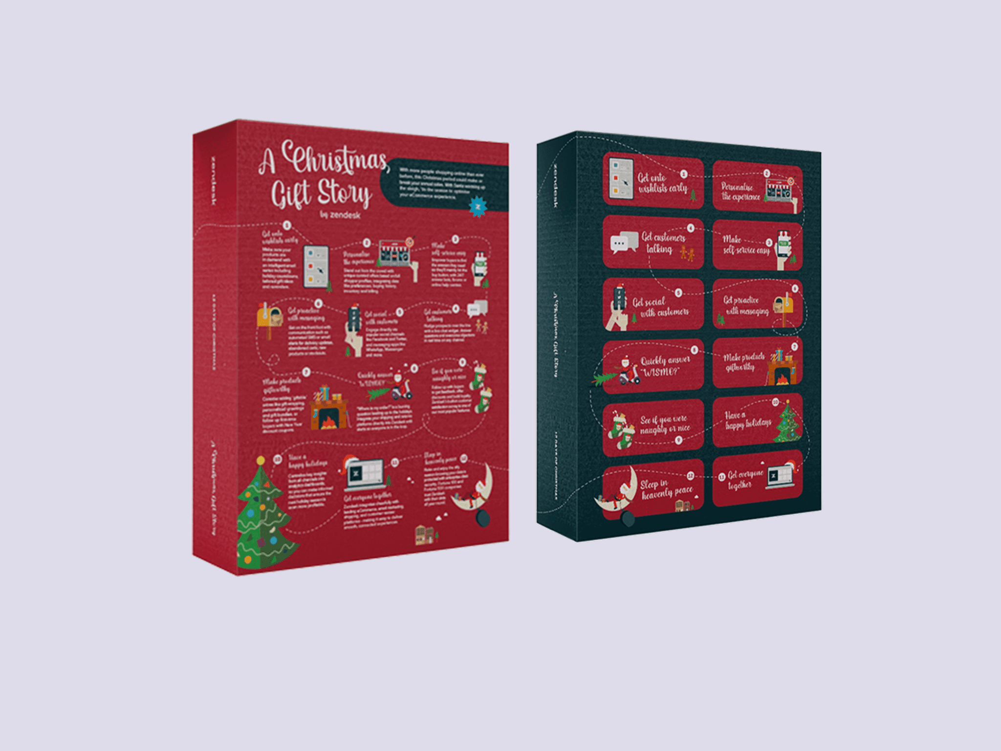
image of a smartphone leaning on top of a record player
UI minimalistic widgets

Christmas in July

OVERVIEW

Christmas in July is a Zendesk holiday gifting campaign for which I developed the campaign's visual language – a Christmas-inspired system applied across an Advent Calendar chocolate box, a personalised A5 card, an at-home cocktail kit, and delivery packaging, all within Zendesk's brand guidelines.

YEAR

2021

ROLE

Art Director

SERVICES

Creative Direction

Concept Development

Campaign Visual Language

Packaging Design

Stakeholder Alignment

About the project

Brief

Develop a Christmas-inspired infographic system for Zendesk, adhering to brand guideline, that could apply consistently across four very different physical formats: an Advent Calendar chocolate box, a personalised A5 card, an at-home cocktail kit, and the delivery packaging itself. As Lead, the real challenge was translating the campaign's written copy into a visual language distinctive enough to work as a gift experience — not just another branded asset.

Concept

The first concept stayed fully within Zendesk's brand guideline (abstract shapes at the time) – and it was rejected. It was technically on-brand, but it didn't reflect the vision the client and marketing manager actually had for the campaign. Rather than iterate within the same visual territory, the project moved into a second concept stage, exploring ideas that were, quite literally, "out of the box" – pushing how far a seasonal campaign could stretch a brand's visual system before it stopped reading as Zendesk.

The second direction became a playful, illustrated advent-calendar system, built to balance three sets of needs at once: brand consistency for Zendesk, creative distinctiveness for the marketing team, and a tactile, giftable experience for the end customer.

Execution

As designer, I developed the visual language and carried it consistently across all four formats (the Advent Calendar box, the A5 card, the cocktail kit labelling, and the delivery packaging) ensuring each piece read as part of one cohesive gift moment rather than four separate assets. The rejection and rethink at the concept stage meant the final execution had to hold up under scrutiny from both the brand guideline and the client's own vision, balancing both without compromising either.

Campaign Continuity

Christmas in July wasn't a single asset. It was one visual language designed to travel across an entire gifting experience:

  • One system, four formats
    The same illustrated visual language carried consistently from packaging through to the personalised card and cocktail kit, so the campaign felt like one considered gift, not a bundle of separate items.


  • Concept resilience
    The willingness to discard a fully brand-compliant first concept in favour of one that better served the client's actual vision, without losing brand recognisability in the process.

image of a smartphone leaning on top of a record player
UI minimalistic widgets

Want to chat more?
CLARENCEVILLANUEVA24@GMAIL.COM

2:45:50 AM

Want to chat more?
CLARENCEVILLANUEVA24@GMAIL.COM

2:45:50 AM

Want to chat more?
CLARENCEVILLANUEVA24@GMAIL.COM

2:45:50 AM